Mapping sensations
_context
_work in progress_
Creating maps is always subjective. As Ruben Pater argues in his book The Politics of Design,
The notion that maps provide an objective or scientific depiction of the world is a common myth. The graphic nature of maps simplifies reality, giving makers and users a sense of power without social and ecological responsibilities. Details like the colouring of areas or the different sizes in typography can have great political consequences.
Not to mention that each map is created by someone, whose perspective is different: his (at least in the times when cartography was established, we have only male names recorded) point of view, his location on the globe and his needs to record some places and routes. The distortions of the map as we know it (the most common map used is the highly distorted Mercator map, made by Gerardus Mercator in 1569) are quite visible on the other tries of making a more accurate depiction: the Winkel Tripel projection (1921) and the Gall-Peters projection map (1973).
Thus, in my work with mapping, i am approaching the matter with high subjectivity. Why not use mapping as a tool to visualise and record things the way we see them - with the full awareness that it is our intention? For my new visual series <mapping sensations/>, i decided to experiment by mapping things i feel. It all started when i tried to explain my long-covid mysterious symptoms to a number of doctors in two languages. At some point, i had to find a way to describe it as clearly as possible, and to remember the key elements, so i don’t miss an important symptom or data around it. For it, i drew a map of my symptoms in my notebook and went with it at the doctor’s appointments. Only to realise, if the doctor is not someone who will listen and pay attention to what i am saying, it is a complete waste of energy. However, that helped me to track the development of the symptoms and to understand where in my body they are (or at least to have a better guess). It also made me realise that i am in a moment of my life, that i fully understand the limitation of doctor's knowledge, experience and ability to deal with my problem - that i need to collect information, process it, and take my own decision of how to handle my treatment. Parted with my childish belief that they can always find what it is and give me a medical treatment which is designed for this particular condition. It’s a team work with the patient - so it makes sense to find a doctor who is a good team player.
As a result of this experiment, i decided to go on trying to map the way i feel about things. In such an introspective period that i am now, it is the only way i feel i am able to express the mix of thoughts & feelings that bother me. Putting them on paper, canvas or digital drawing, helps me acknowledge and release them and to move on.
_works
people in (my) life
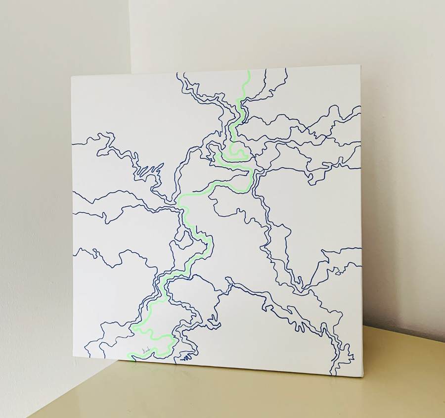
This mapping experiment approaches people's lives as lines. Whilst the centre line (in neon green) is the protagonist's lifeline, the blue ones are the people who enter and exit one's life in different moments. In the first sketch, I tried mapping enter and exit of people only without any overlapping. However, when I started drawing the canvas, I felt that even in this simplified version, people's interactions are usually entangled at some point. Thus, here we can see people who meet in different periods of their lives, people being born later, people who die, etc.
This work is available for purchasing, current location: Nicosia (CY).
_references & inspirations
★ Kollektiv Orangotango and Transcript (Firm (2019). This is not an atlas : a global collection of counter-cartographies. Bielefeld: Transcript Verlag.
★ Pater, R. (2016). Politics of Design : A (Not So) Global Manual for Visual Communication. Amsterdam: Bis Publishers.
